
A marketing campaign without strong visuals is just noise. People process images far faster than text, and one widely cited figure puts that speed at 60,000 times faster. This is why good visuals grab attention before a headline even lands.
Many businesses still treat visuals as an afterthought:
- A social post gets built from a quick template.
- A brochure is designed in a different style.
- A banner uses one font, while the print piece uses another.
This kind of mismatch weakens trust. Unfortunately, it is also very common. A Lucidpress brand consistency report found that 77% of companies deal with off-brand content, and it said consistent branding can lift revenue by 10–20%.
This is where graphic design earns its place. It is not just about making things look polished. It gives your campaign a clear visual system. It ties social ads, brochures, banners, and landing pages together so they feel like one brand.
The First Touchpoint: Building an Identity with Strategic Logo Design
Every campaign starts with identity. Before a prospect reads your copy, they notice your mark, colors, and shape language. This first impression sets the tone for everything that follows.
Your ads, flyers, brochures, and digital banners all borrow from the same brand source. If this source is weak, the rest of the campaign feels scattered. If it is strong, every channel speaks with the same voice. This is why the first visual asset matters so much. It becomes the anchor for the rest of the work.
The Strategic Layer
A well-built mark shapes more than recognition. It influences your color palette, type choices, and the feeling people carry when they see your brand.
- Sharp angles can suggest precision and control.
- Soft curves can feel open and approachable.
- Heavy type can signal strength.
- Light type can feel modern and calm.
These are small choices, but they set the emotional direction of a campaign.
Scalability matters just as much. A mark has to work everywhere. It must stay readable as a favicon in a browser tab. It must also hold up on a billboard or trade-show backdrop. If a design breaks at either end, the system falls apart. Strong identity work stays clear in every size and format.
The Content Buffer
Details inside the mark also send signals. Geometry suggests structure while negative space suggests confidence. Font weight also suggests authority or softness. These elements work quickly. People may not name what they see, but they feel it. This instant reaction helps a brand look credible before a single sales message appears.
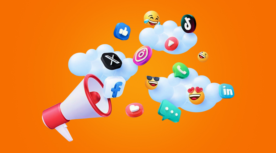
Capturing the Scroll: Digital Banners and Social Media Graphics
Digital spaces move fast. People scroll through feeds, stories, and banners while juggling messages, tabs, and tasks. This means your visual has to do its job almost immediately. Social ads on Instagram, Facebook, and LinkedIn sit in crowded spaces. Programmatic banners do too. You only get a brief moment to earn attention.
Design Mechanics for Conversion
The best social creative keeps one idea front and center. For the best result, the image needs to support the message, not fight it. The copy must be short and clear. The call to action must stand out without feeling forced. The aim is to ensure that people know what the ad offers at a glance.
Platform fit matters too. A vertical story needs a different rhythm from a square feed post. For a wide display banner, the layout needs to be different than that of a mobile-first ad. When the format matches the platform, the message feels native instead of awkward. This simple adjustment often improves response.
Good campaign visuals also use design principles with purpose. Balance, contrast, spacing, and color all guide the eye. The goal is not decoration but action. Better structure lowers wasted impressions, improves click-through rates, and makes paid media spend work harder.
Discover how your logo performs across different backgrounds.