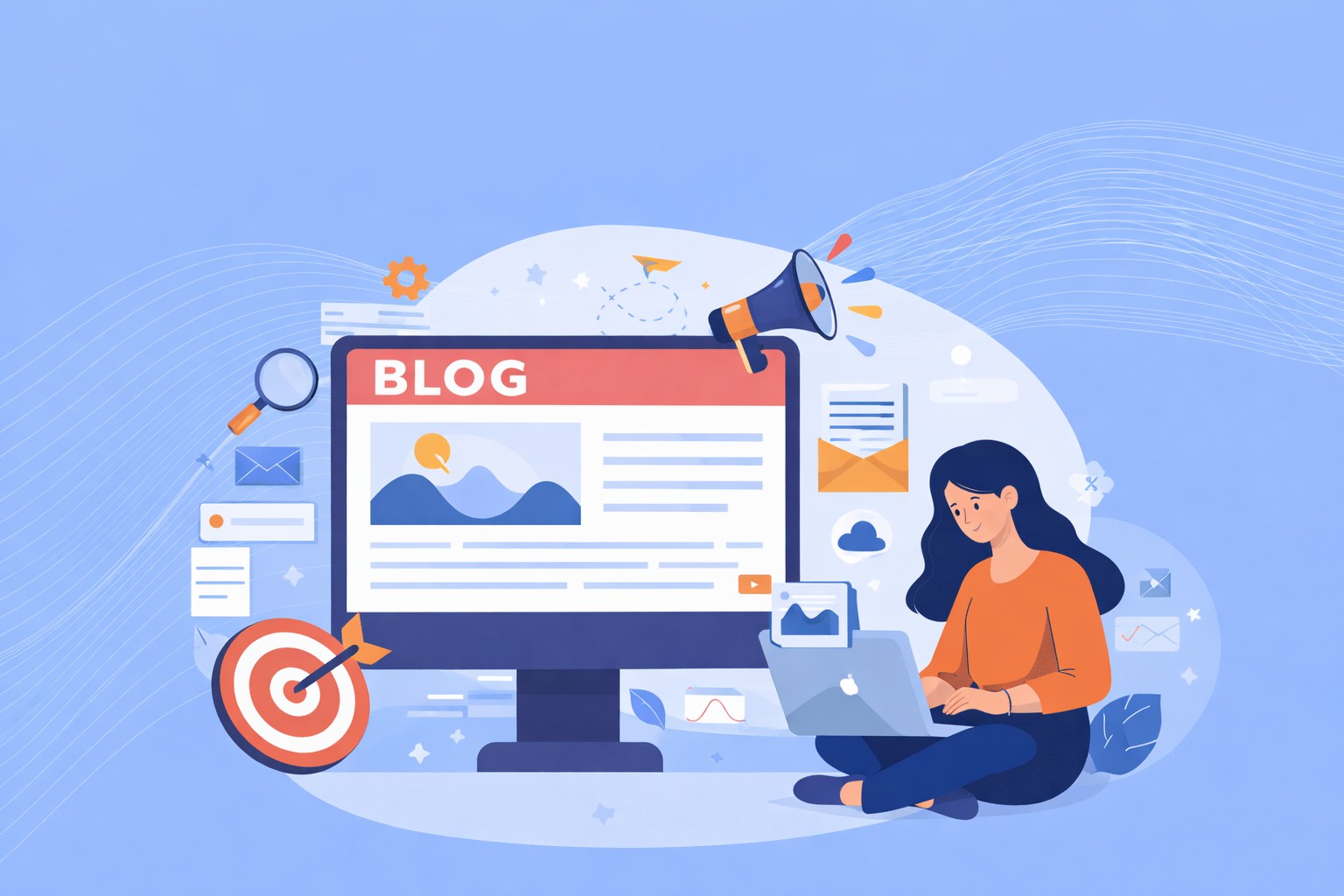

Businesses pour money into ads. They win clicks. But often, the problem isn’t the ad. It’s the landing page. They lose conversions on the landing page. This gap is costly. The click and the conversion feel disconnected. The missing link? Landing page psychology.
This blog walks through the key psychological principles and design elements that lift PPC conversion rates. We’ll cover first impressions, hierarchy, social proof, forms, mobile behavior, and practical design choices you can test. If you run paid campaigns, this is important.
The Psychology Behind First Impressions
People judge pages fast. They form impressions in a flash. This snap judgment shapes trust and whether visitors stay. Our brains process visual scenes instantly.
Cognitive Load Theory explains it: the brain filters and prioritizes visual signals to decide what matters. Too much noise, and people leave. Clear, simple pages lower mental effort. Trust signals matter immediately. The following gives credibility in seconds:
- Clean Visual Hierarchy – A clear headline, readable fonts, and tidy spacing communicate competence.
- Real Imagery Over Generic Stock Photos – Authentic pictures build trust.
- Brand Match From Ad to Page – If the ad promise and the landing page tone, visuals, or offer differ, visitors feel misled.
Match expectation. If the ad promises “20% off,” the landing page should show that exact offer front and center. Color influences feeling and action. Use palettes that suit your audience and make CTAs pop. Contrast helps the eye pick the right action quickly.
Above the fold, show the headline, primary benefit, and the main CTA. If visitors don’t see the clear next step instantly, you lose them.
Psychological Design Elements That Drive Conversions
Visitors don’t decide to convert by accident. They respond to subtle cues. These small design choices influence trust and attention. Let’s look at the specific design principles you must keep in mind.
Visual Hierarchy and the F-Pattern Reading Behavior
People rarely read web pages line-by-line. Eye-tracking shows common patterns: the F-pattern on text-heavy pages and the Z-pattern for simpler layouts. Design should guide those scans.
Place important headlines and benefits on the top-left flow for F-pattern pages. Use larger type, bolding, and whitespace to create a clear path. Make the CTA visible where eyes naturally land.
From a technical perspective of website design, ensure headings use semantic HTML and that CSS scales cleanly across devices so hierarchy survives smaller screens.
The Power of Social Proof and Trust Elements
A study by the Medill Spiegel Research Center shows that pages displaying five or more authentic reviews can increase conversions by up to 270%. This highlights how strongly people rely on real experiences when making decisions.
Social validation reduces anxiety. Use customer quotes, ratings, logos, short case snippets, and security seals. People follow crowds and defer to authority. Show credible proof close to the CTA.
Design placement matters. Put testimonials near the action, not buried low. If your site supports it, show dynamic proof, like recent signups or purchases, to signal activity. From a development angle, use lightweight widgets or server-side rendering to avoid slowing the page while fetching reviews.
Strategic Use of White Space and Cognitive Ease
Cognitive ease means the easier a page is to process, the more comfortable users feel. Simpler layouts reduce friction and build trust. Remove competing CTAs. Group the related content. Let elements breathe. White space gives focus. A button surrounded by breathing room reads as important. Aim for clarity over cleverness. Users will click what feels obvious.
Directional Cues and Visual Flow
People follow visual cues. One example of such cues is faces looking toward a CTA. Another example is arrows that point down the funnel. Subtle shapes create motion. Use these to nudge attention toward the conversion goal.
Micro-interactions, like small hover or entrance animations, help confirm choices. Implement them sparingly and test. They must reassure, not distract. Your website development team can use lightweight CSS or small JS libraries to add cues without hurting speed.
Color Contrast and the Von Restorff Effect
Distinctive items stand out. The Von Restorff (isolation) effect explains why a lone, contrasting item gets noticed and remembered. Use contrast for CTAs so they truly pop. This doesn’t mean pick the “best” color universally. Color choice depends on background, brand, and culture. Always A/B test.
Scarcity and Urgency Principles
Scarcity triggers action. Limited availability or time cues create urgency. Use countdown timers and clear inventories when ethical and real. Be honest. False scarcity hurts trust. Design these elements so they support the decision, not coerce it.
Form Design Psychology: Reduce Friction in the Conversion Path
Forms can make or break a landing page. Even small hurdles like too many fields, unclear instructions, or slow feedback leave an impact. They create friction and drop-offs.
Understanding the psychology behind form design helps you avoid mistakes. It guides users naturally toward conversion. Let’s explore key design strategies that reduce friction and boost completion rates.
Fewer Fields, Higher Conversions
The paradox of choice applies to forms. Every extra field adds friction. Keep required fields minimal. Ask for critical info only. Don’t confuse or intimidate people with way too many fields.
Progressive Disclosure
For complex conversions, use multi-step forms. Show progress. Break the task into friendly chunks. Users tolerate a few screens if each step feels short and obvious.
Visual Feedback and Micro-Interactions
Give them feedback too. Provide real-time validation. Show clear success or error messages. Use progress indicators to reassure users. These micro-interactions lower anxiety and speed completion.
Input Field Design Psychology
Field length should hint at expected input. Use smart defaults and employ auto-complete where possible. Label clearly and offer helper text for tricky fields.
Button Psychology
Write action-focused copies. Tell users what happens when they click. Use size and placement guided by Fitts’s Law. Bigger, closer targets are easier to tap or click. Surround the primary button with white space. Make secondary actions visually lighter.
Privacy Reassurance
Show privacy notes or short assurances for data handling near the submit button. A small line like “We’ll never share your info” reduces hesitation. Combine good design and robust development. This produces smooth, trusted forms that convert.
Mobile-First Psychology: Thumb-Friendly Design for Touch Interfaces
Mobile users interact differently from desktop visitors. Optimizing for their behavior boosts conversions. Let’s examine practical design strategies that make mobile experiences seamless and thumb-friendly.
- Mobile Context: Users are often distracted or on the go. Keep offers simple.
- Thumb Zones: Place primary actions within easy reach. Design with common hand positions in mind.
- Simplify Navigation: Reduce choices and make the next step obvious.
- Tap Targets: Respect touch target sizes to build tapping confidence.
- Speed Matters: Delays increase anxiety and abandonment. Optimize assets, compress images, and use fast hosting.
- Vertical Flow: Lean into natural scrolling. Present a single clear path.
- One-Tap Actions: Click-to-call and direct checkout reduce steps.
Improve PPC Performance with Psychology-Driven Design
Conversion optimization isn’t manipulation. It’s about matching design to how real people think and act. When you reduce friction and honor expectations, paid clicks become customers.
Most businesses ignore landing page psychology. This creates an advantage for those who don’t. Combine design intent with technical rigor. Let designers shape the message and developers deliver it fast and consistently.
Knovial builds conversion-focused sites and handles the full delivery pipeline. Our process maps closely to what high-converting landing pages need: clear hierarchy, reliable performance, and message match with ads.
Review one landing page today. Note the headline, the primary benefit, and the first visible CTA. If any of those feel unclear in 3 seconds, you’ve found an experiment. Contact us today to get started!