
Traffic is high, and the analytics look healthy. Yet leads stay stubbornly low. Feeling frustrated is common at this point. Many businesses spend on ads, SEO, and content. They attract clicks. Still, visitors leave without contacting them.
Website optimization isn’t only about bringing people in. It’s about shaping the whole journey. A few design and messaging moves can turn casual visitors into real prospects.
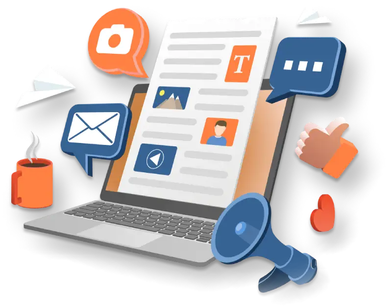
Conversion optimization works when multiple elements align. Below, we unpack the psychology and the mechanics — and show what to do next. You’ll get design and content moves, trust builders, conversion-focused layouts, form fixes, and smart exit strategies.
Understanding the Psychology Behind Website Conversions
People don’t buy from pages. They react to signals. Speed, clarity, and trust shape decisions. A visitor scans and judges credibility fast. They pick the path of least friction. Give clear cues, and they’ll convert. Start with first impressions. Then build trust. Then make the action obvious.
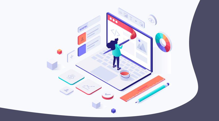
First Impressions Matter: The Role of Visual Design
Visuals set the tone. A crisp layout signals competence. A messy one suggests amateurism. People form split-second opinions about sites. This instant shapes whether they stay. Use clean typography, balanced whitespace, and clear headings to pass that test.
A well-crafted logo anchors identity. Visitors expect a logo that looks intentional. It boosts perceived legitimacy. Use size, contrast, and spacing to guide attention. Headlines, subheads, and buttons should form a clear visual ladder. Graphic accents should support the message, not clutter it.
People equate design quality with service quality. Higher perceived value can justify higher prices and increase conversion intent. Match colors, tone, and imagery across the site, ads, and social. Consistency reduces cognitive load and speeds recognition.
Building Trust Through Design Consistency
Trust grows from repeatable signals. Design consistency is one of those signals. Seeing the same logo across pages and assets helps visitors feel that they landed in the right place. This small comfort increases willingness to act. Custom icons, clear charts, and polished visuals show care. They tell visitors you invest in your craft.
Use original photos where possible. Limit your palette. Add consistent button styles and microcopy to reduce uncertainty. A high-quality site lowers suspicion. This increases lead intent and shortens the decision path.
Essential Website Elements That Drive Lead Conversion
Design and copy must point visitors to the next step. Below are the elements that do that reliably. We’ll cover above-the-fold messaging, CTAs, navigation, trust elements, forms, visual content, and exit-intent tactics. Start at the top of the page, then work through the journey to conversion.
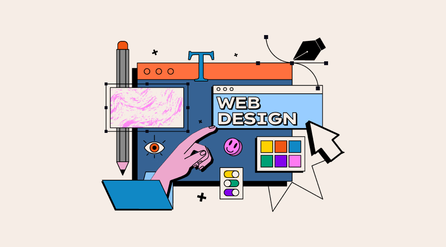
Crafting Compelling Value Propositions Above the Fold
Above the fold is prime real estate. Use it wisely. Lead with a short headline that answers “What’s in it for me?” Use a one-line benefit, then add a supporting sentence. Put the main value statement near the logo and main CTA. Repeat it in different formats down the page. Place the logo top-left or centered in the header. Make sure it’s crisp on mobile.
Use graphic design to highlight key messages. Use contrast, subtle background shapes, or an icon to draw attention to the core line. What drives an effective value proposition is headline + subhead + CTA in a single visual block. Ineffective placement is when there is a long hero image with no clear statement.
Optimizing Call-to-Action (CTA) Buttons for Maximum Impact
A button isn’t a decoration. It’s the conversion device. Place a primary CTA above the fold and repeat it at key intervals. Match the CTA to the intent of the section. Choose a color that contrasts with the surrounding palette. That contrast makes the CTA stand out without clashing. Use clear verbs tied to value. “Get a free audit” beats “Submit.” Keep it short.
Pay attention to size, shape, and whitespace. Make buttons large enough to tap on phones. Add breathing room so they don’t get lost in copy. Test copy, placement, color, and size. Use small, iterative experiments to refine what converts best.
Streamlining Navigation and User Experience
Navigation should help people do what they came for, fast. Simplify primary menu structures by limiting items. Use clear labels like Services, Pricing, Case Studies, Contact, etc. Map common visitor journeys. Make the path from the landing page to the CTA as short as possible.
Design mobile menus that open with a single tap. Place key CTAs where thumbs reach easily. Remove unnecessary steps. Minimize required clicks. Offer a progress indicator for multi-step tasks. Use directional cues—arrows, gaze lines, and contrast—to lead eyes toward CTAs.
Creating Trust-Building Elements Throughout Your Site
Trust elements reduce doubt. They nudge visitors toward action. Place short, named testimonials near CTAs. Use quotes that mention outcomes, not just praise. Show recognizable client logos. Link to short case studies that describe the problem, approach, and result.
Use security badges and trust seals to your advantage. Display SSL seals, payment badges, and certifications where relevant—especially on forms and checkout. Use professional imagery when possible. Stock photos can work, but pick authentic, context-rich shots.
Optimizing Forms to Reduce Abandonment
Forms are conversion gates. Make them easy to pass. Ask only what’s necessary. Ask for the minimum data you need. Name, email, and one qualifying question often suffice. Use multi-step forms that reveal fields gradually. This reduces intimidation.
Clear error messaging. Use plain language for errors, offer solutions, and show inline validation. Use large touch targets and autofill attributes. Keep inputs stacked vertically so that they are mobile-friendly. Add short supporting copy, progress bars, and friendly microcopy to reassure users.
Leveraging Visual Content to Increase Engagement
Visuals keep attention. Better visuals encourage deeper engagement and more page views per session. They also explain complex ideas fast. Use infographics and data visualisations strategically. Turn case-study numbers into simple charts. Highlight the core impact.
Short explainer videos near CTAs increase conversions. Keep them under 90 seconds. Design lead magnets—PDFs, checklists, templates—so they look valuable at a glance. Custom images score higher on trust. Use stock only where custom isn’t feasible. Take the help of professionals if necessary.
Implementing Strategic Exit-Intent Strategies
Exit intent catches people before they leave. Use it sparingly and smartly. Offer precise value—discounts, guides, or a quick audit in exchange for contact info. Make the exchange balanced: give something genuinely helpful, not just noise.
Keep overlays simple. Use clear headings, a short benefit line, and a single CTA. Test triggers. On slow pages, reduce delay. On fast pages, trigger closer to exit.
From Inspiration to Action — Your Next Steps
Conversion lifts happen when UX design, copy, trust signals, and forms work together. It is an ongoing process. A/B test constantly. Tweak copy and visuals. Monitor metrics and iterate.
If you want expert help with strategy and execution, Knovial offers end-to-end website development and design services. Our process includes discovery, prototyping, website design, development, and testing — which saves time and aligns work to measurable goals.
Good design turns clicks into customers. It’s an investment that pays back through higher lead quality and better close rates. Book a free consultation. Ask for a focused website audit. See where you stand.